My approach to dialog boxes in Power Apps
Updated:
3 min read
Reza recently posted How to Build a Popup Dialog Box in Power Apps using Responsive Containers on YouTube. I wanted to share my approach to dialog boxes in Power Apps and contrast the differences. If you're unfamiliar with generating dialog boxes in Power Apps, watch Reza's video, as it's a good explainer.
Let's compare my version to Reza's version.
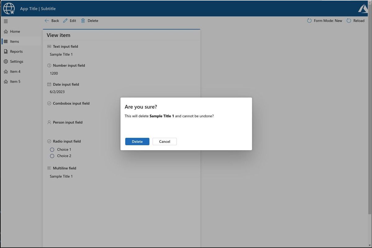
It's most beneficial to compare the differences in our approaches. I feel Reza's example is just a rough and ready proof of concept to demonstrate the concepts to his viewers. The styling on my version is more production-ready.
Here are some differences worth noting.
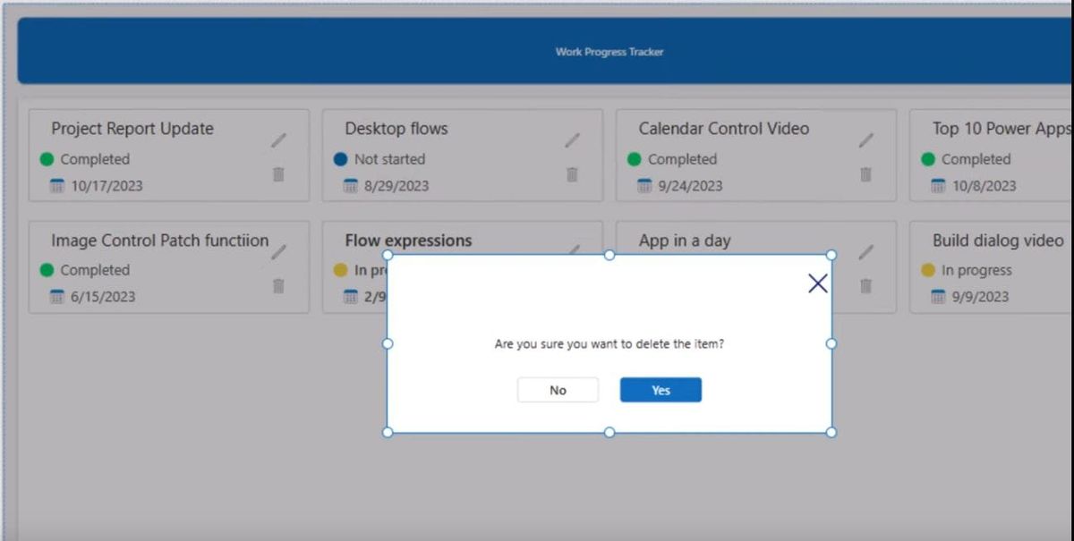
Close button on the dialog #
Reza uses an X icon as a close button on his dialog box. Developers often use this pattern, but we shouldn't use it here. The Fluent 2 Design System says we should only use the close button if there's no other way to cancel/close out of a dialog.
Someone can dismiss a modal dialog by selecting an area outside of the container, using the Esc key, or selecting a footer button. You can include a Close button in the top right of modal dialogs if there is no Cancel button that will close the dialog.
Global vs local varibles to control dialog visiblity #
I prefer using UpdateContex() instead of Set() in this instance. Global variables can become problematic if you have several screens using dialog boxes. With local variables, I can reuse the same variables throughout my application without worry of a screen being in an incorrect state.
The pattern I use is to use a local variable named locScreenMode. For the OnSelect setting for the Delete button, I set the local variable like so:
UpdateContext({locScreenMode: "Delete"})Then the Visibility settings for the top level container is setup like so:
If(locScreenMode="Delete",true,false)I can repeat this pattern on many screens with dialogs without managing a global variable naming system.
Attention to detail in styling #
As I previously said, I believe Reza's example is a rough and ready proof of concept to demonstrate these concepts to his viewers. I am pointing out some unusual spacing and alignment in Reza's example. We should take the time to make things line up correctly, as I believe it makes a massive difference in how the application is perceived.
- The top and right alignment padding should be the same. Having more padding at the top than the right makes it look... off.
- The top padding of the dialog text is... off.
Wrapping up #
Do you have thoughts on this or do you want to share how you handle dialog boxes? Hit the Reply by Email link below!
Thanks for reading.