How to create a border-top linear gradient
2 min read
I learned something new today so I wanted to share!
I wanted to create a linear gradient border-top on a call out section on my blog.
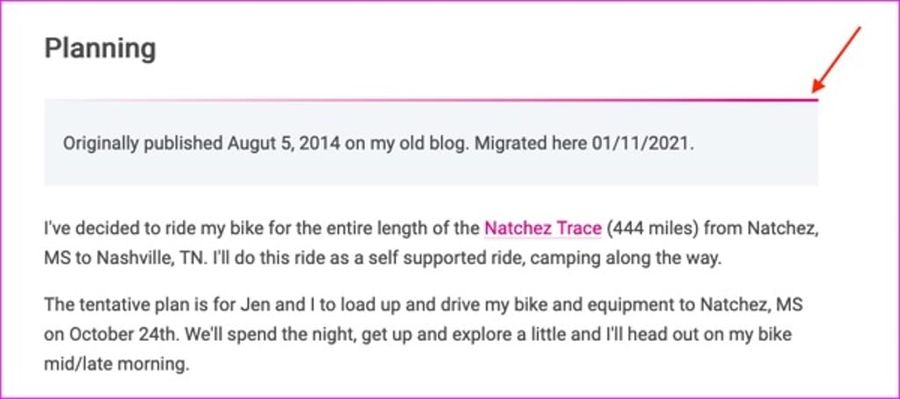
My searches weren't bringing up the specific example I needed to make it work so I had to dig in deeper.
CSS-Tricks had the closest example in Gradient Borders in CSS. The third example is super close as it had two borders but they were on the sides and not the top. Me, fundamentally not understanding how border-image works, couldn't tinker with code pen to make it do what I wanted. I did try reading the MDN docs for border-image but it just wasn't clicking for me. Finally, I took to Twitter where my friend Stephan saved me from myself:
https://twitter.com/Vanaf1979/status/1349050068670828547
Eureka! With Stephan's explanation, it finally clicked for me that border-image-slice works in a quadrant system, kind of like margin and padding. In addition to Stephan's tweet, the syntax section on border-image-slice is the bit that really helped lock it in for me.
- When one position is specified, it creates all four slices at the same distance from their respective sides.
- When two positions are specified, the first value creates slices measured from the top and bottom, the second creates slices measured from the left and right.
- When three positions are specified, the first value creates a slice measured from the top, the second creates slices measured from the left and right, the third creates a slice measured from the bottom.
- When four positions are specified, they create slices measured from the top, right, bottom, and left in that order (clockwise).
Here's what I landed on for my specific application.
.div {
  border-top: 3px solid;
  border-image: linear-gradient(to right,#f1f5f7,#d80b77) 1 0 0 0;
}
I hope this helps someone else who's searching "create border-top linear gradient". 😆
That's all for now. Thanks for reading!

Leave a comment